How to Make Perfect Seamless Patterns: 5 Mistakes to Avoid

Whether you're an experienced creator or just beginning your design journey, seamless patterns offer endless possibilities for bringing style and personality to your projects. In this tutorial, we'll explore what makes these designs exceptional and share five common mistakes to avoid for professional results.
A seamless pattern, also known as an all-over print or repeat print, is a design that tiles continuously across any surface without visible breaks or gaps. The magic lies in a single, carefully crafted tile with perfectly blending edges that creates an uninterrupted flow when repeated. You'll find these versatile designs everywhere: from fashion textiles and wallpapers to product packaging and digital backgrounds.
When done right, seamless patterns create visual harmony where it's nearly impossible to spot where one tile ends and another begins – that's the hallmark of great pattern design.
Mistake #1: Ignoring Seamless Alignment
One of the biggest mistakes in pattern design is creating a pattern that doesn't actually repeat seamlessly. Every edge of your pattern tile must connect perfectly – any design element that extends beyond the tile's boundaries needs precise positioning to ensure a flawless repeat. Even the slightest misalignment can disrupt the flow, making your pattern look disjointed and unprofessional.
Want to check if your pattern truly tiles? Our free Seamless Pattern Checker instantly reveals any alignment issues by displaying multiple repeat views at different zoom levels. Simply upload your design to spot visible seams or mismatched edges before going to production, ensuring your designs will look flawless whether printed on small accessories or large wallpaper rolls.
If you discover your pattern has alignment problems, don't start over. You can fix the seams of any flat image such as vintage fabric scans or ChatGPT outputs, into perfectly tileable designs. The AI intelligently completes the edges and blends everything seamlessly while preserving your original artwork at the center.
The best part about using PatternedAI? Our AI automatically ensures that every pattern you create is perfectly seamless from the start, eliminating alignment worries entirely. This lets you focus purely on creativity – experimenting with colors, styles, and motifs – while knowing your final design will tile flawlessly.
Mistake #2: Overcrowding or Leaving Too Much Empty Space
Negative space plays a crucial role in the overall composition of a seamless pattern. When used effectively, it creates balance and gives the design a polished, intentional look. However, if the elements are placed too closely together, the pattern can feel overcrowded and overwhelming. On the other hand, excessive empty space can make the design appear unfinished or lacking in structure. Unless large gaps are a deliberate stylistic choice, it's generally best to distribute elements evenly to maintain visual harmony.
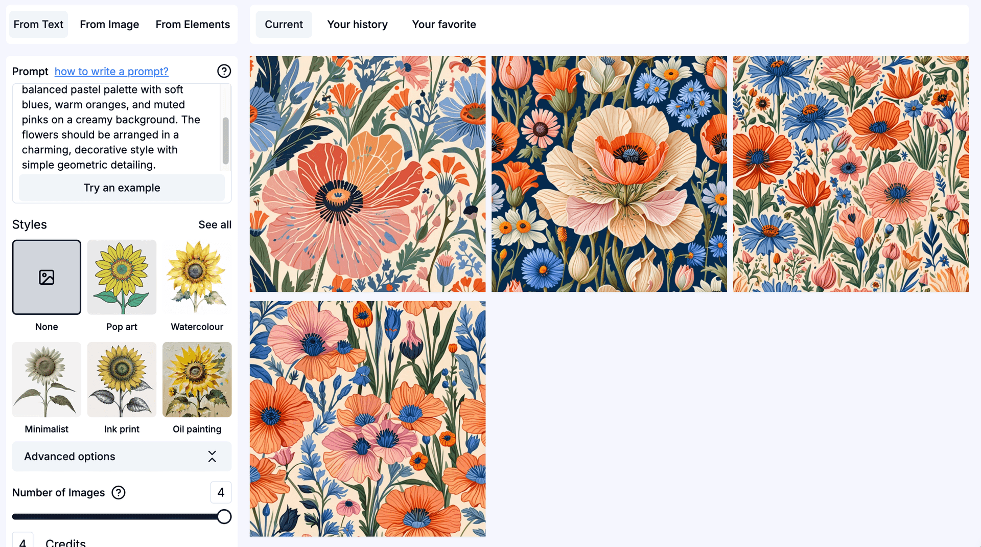
Now, let’s take a look at an example from our tutorial Fresh & Floral: 5 AI Prompts for Spring Patterns :
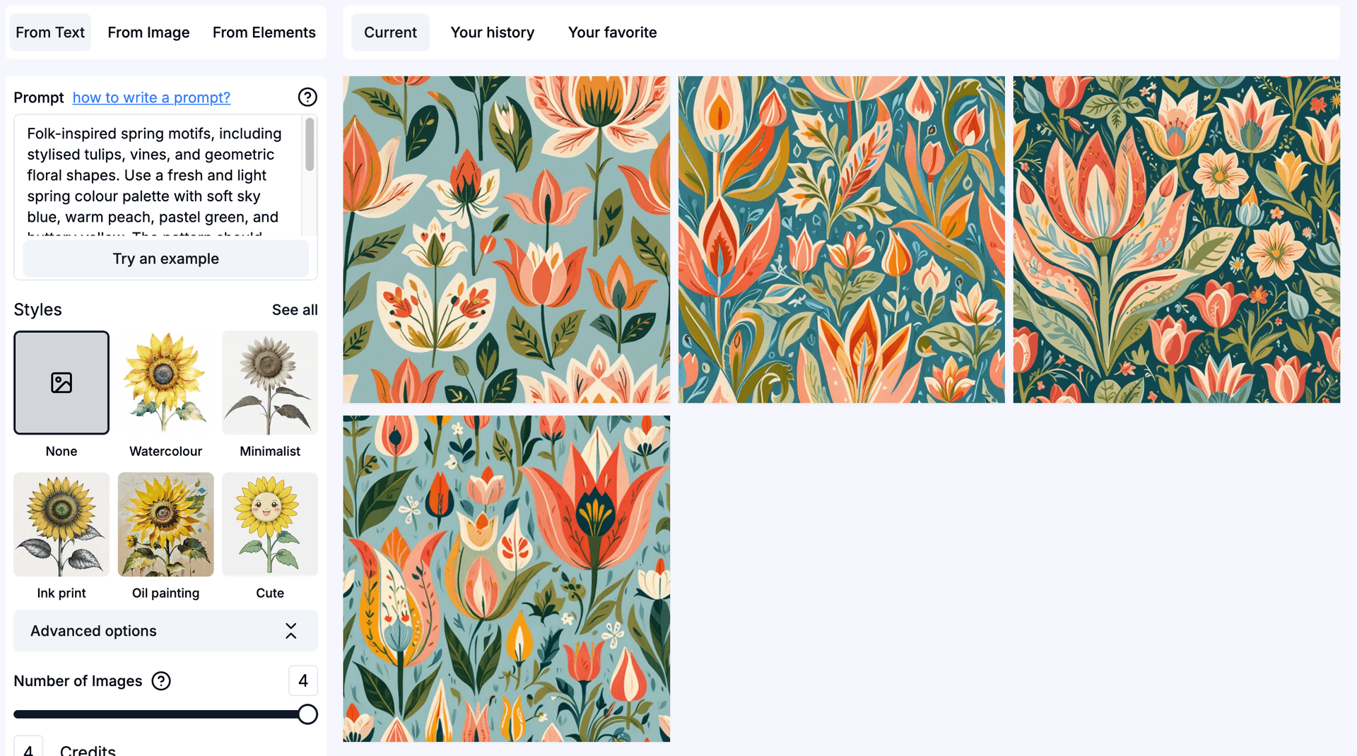
In this pattern prompt, we included a variety of elements, resulting in patterns #2 and #3 appearing quite dense and busy. Instead, options #1 and #4 offer a better balance between negative space and design elements, making them more visually harmonious.
Now, let's explore the opposite scenario using another prompt from the same tutorial with the Pop Art style applied:
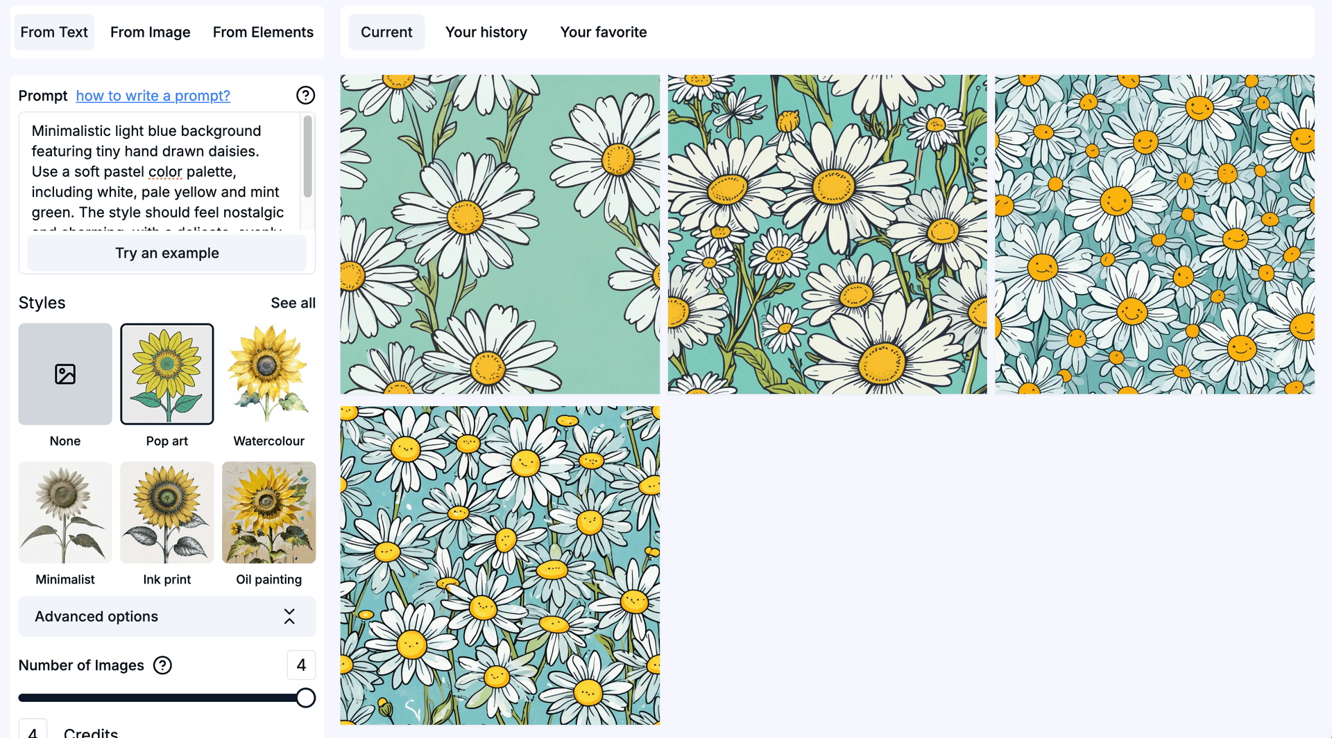
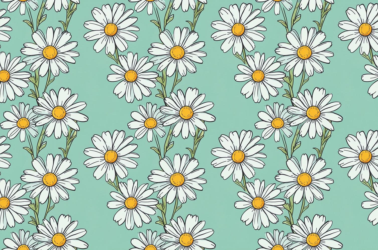
In the generated patterns, option #1 appears to have excessive negative space, which becomes more noticeable when you click on it and zoom out.
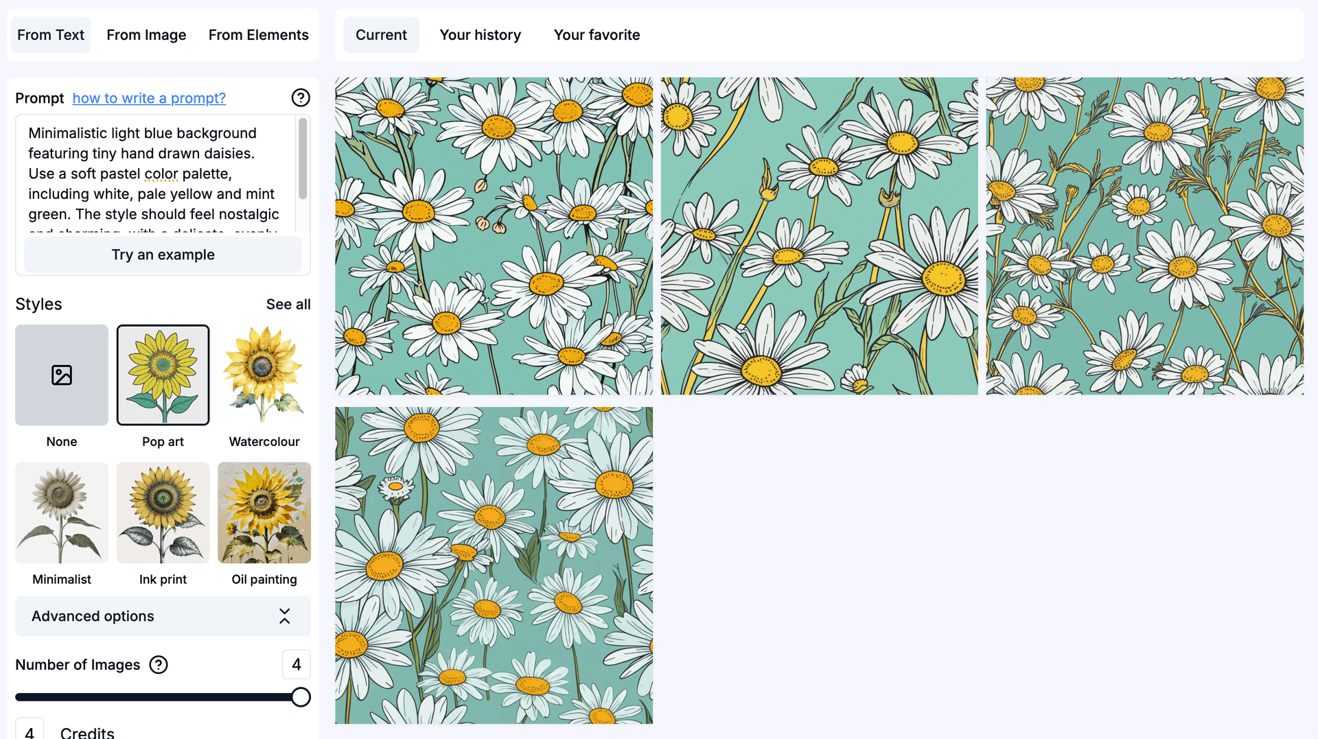
Conversely, patterns #2, #3, and #4 are overly dense, making the composition feel too crowded. The best approach is to generate another set of patterns for better balance. In the newly generated set, options #1, #3, and #4 offer a more harmonious distribution and are great choices to use:
Mistake #3: Using Disproportionate Elements
Achieving a balanced composition is key to creating a seamless pattern that looks natural and visually appealing. If one element is significantly larger than the rest, it can dominate the design, making the pattern feel lopsided and disrupting the seamless flow. A well-balanced pattern ensures that no single element overwhelms the composition, allowing the eye to move smoothly across the design without being drawn to an unintentional focal point. Maintaining a consistent scale among elements creates harmony, making the pattern truly seamless when repeated.
The example above perfectly illustrates this issue. While all the generated patterns are visually appealing, patterns #1 and #2 feature one element that is noticeably larger than the others, disrupting the overall balance. This becomes especially clear when we click on the pattern and zoom out:
When the pattern tile is repeated, the oversized element stands out too much, making the repetition obvious and disrupting the seamless effect. In well-designed patterns with multiple elements, the repeat should feel natural and effortless, blending harmoniously so that the viewer doesn’t immediately recognize the tiled sections. The goal is to create a design that flows smoothly across the surface, rather than one that appears as a clearly repeated block. In this case, options #3 and #4 from the current generation maintain a well-balanced composition, ensuring a more cohesive and visually appealing seamless pattern.
Mistake #4: Choosing a Weak or Clashing Colour Palette
Colour is one of the most crucial elements in any seamless pattern. A well-chosen palette can enhance the composition, create mood, and ensure the design feels cohesive. On the other hand, a poorly selected colour combination can make even the most beautiful pattern feel disjointed, overwhelming, or dull. Colours that clash too harshly can be distracting, while overly similar shades can make the pattern feel flat and lifeless.
When creating your seamless pattern with Patterned AI, you can specify your desired colour palette directly in the text prompt. Now, let’s take a look at an example to see how colour choices impact the final result.
We’ll continue using the same prompt from the last example. Below is the original prompt we used:
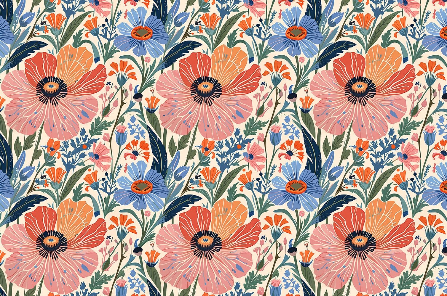
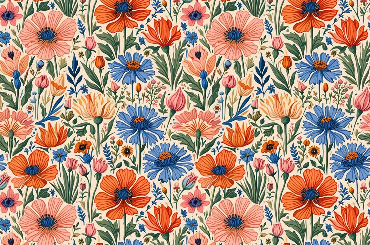
Stylized folk-art interpretation of spring wildflowers, including poppies, cornflowers, and irises. Use a balanced pastel palette with soft blues, warm oranges, and muted pinks on a creamy background. The flowers should be arranged in a charming, decorative style with simple geometric detailing.
We adjusted the colour palette by replacing the soft, harmonious pastels with a high-contrast mix of fluorescent yellow, electric blue, and muddy brown:
Stylized folk-art interpretation of spring wildflowers, including poppies, cornflowers, and irises. Apply a high-contrast palette of fluorescent yellow, electric blue, and muddy brown with a bold gray backdrop. The flowers should be arranged in a charming, decorative style with simple geometric detailing.
Let’s take a look at how this change affects the final pattern:
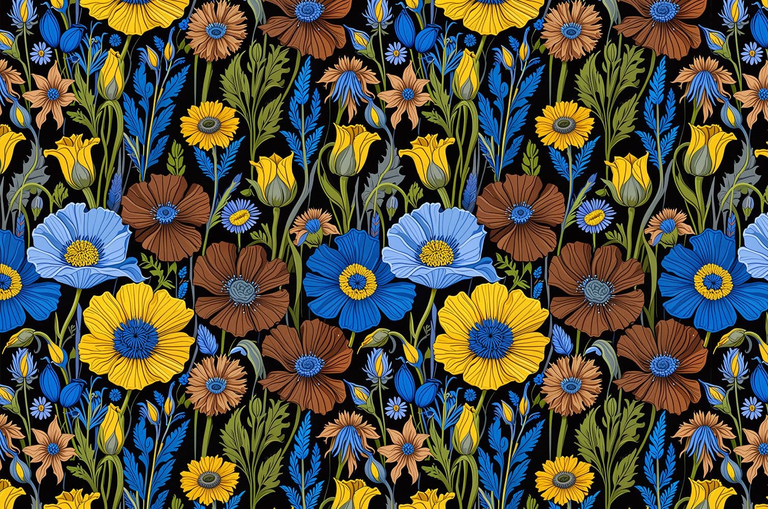
The result clearly shows how a poorly chosen colour palette can impact the overall design. The combination of electric blue and muddy brown creates an unappealing contrast, making the pattern feel disjointed and harsh rather than harmonious and visually pleasing. Colours play a crucial role in setting the mood and usability of a seamless pattern, and a mismatched palette can overshadow even the most well-balanced composition.
To ensure your pattern looks polished and professional, take the time to select colours that complement each other. You can also recolor your pattern later to explore alternative colorways that might work bbetter.
Mistake #5: Overlooking Scalability and Resolution
A pattern that looks sharp on a phone case can become pixelated when scaled up for wallpaper or fabric printing. This scalability issue is especially critical in branding and packaging, where the same design must work across everything from business cards to billboard-sized displays.
Resolution requirements vary dramatically by application. While a small PNG might suffice for digital mockups or compact products, professional printing demands much higher quality – fabric printing typically requires 300 DPI resolution, and large-format wallpapers need even more pixels to maintain crisp details.
You can increase the size of the pattern you like with our Upscale tool. It intelligently enlarges any design up to 8,200 × 8,200 pixels while maintaining perfect seamlessness. Unlike basic resizing that creates pixelated results, our AI technology smooths transitions, removes artifacts, and preserves color harmony throughout the upscaling process, essential for preparing designs for commercial printing applications.
Creating Professional Patterns Made Simple
By addressing these five common mistakes – alignment, balance, color harmony, theme consistency, and scalability – you'll create patterns that work beautifully across any application. PatternedAI streamlines this entire process with AI that ensures perfect tiling, offers intelligent style adjustments, and provides the resolution options you need. Focus on your creative vision while our tools handle the technical precision.
Now that you know how to refine your patterns, start experimenting in Patterned AI! And check out our Blog for more design tips and inspiration.